On April 7, less than a month after reported cases of COVID-19 began to rise dramatically in the United States, the rate of new infections reached a peak: an average of 31,630 new cases per day, meaning close to 10 in every 100,000 Americans were testing positive daily. For months, that figure stood as the worst day in the pandemic’s spread at the national level.
Until now. The latest data show that, on Tuesday and Wednesday of this week (June 23 and June 24), the U.S. surpassed that high-water mark, at more than 31,700 infections per day. The state of the pandemic in this country is officially worse than it has ever been.
What is particularly troubling about this trend is that the country as a whole was on the right track through the end of May (unlike a number of states, such as North Carolina, which never flattened or showed extended signs of progress) even if it wasn’t out of the woods entirely. The fact that those positive signs all flipped in polarity suggest that, whatever combination of factors led to this resurgence, one thing is clear: the nation did not adapt to changing circumstances.
Assigning causes and effects to peaks and valleys in a dataset as complex as this one is a dangerous business. But as my colleague Tara Law and I reported last week, greater availability of testing is very unlikely to explain the surge in cases. And one cannot ignore the fact that many states began cautiously reopening public spaces around Memorial Day, about two weeks before the numbers in the U.S. took off. That’s about COVID-19’s typical incubation time.
The virus has also struck the country asymmetrically, moving from dense urban centers to less populated regions, which requires a nimble shift in public interventions to combat.
Crunching the Numbers
One might reasonably ask why we didn’t notice this yesterday, since the peak value came two days ago. The answer involves just a smidgeon of math. We’ll get through it together.
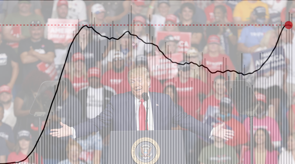
Every evening, a team at Johns Hopkins University publishes daily figures on the number of COVID-19 cases (and resultant fatalities) on a worldwide, national, U.S. state and U.S. county level. As you can see from the gray bars in the above chart, these figures, when graphed day-by-day (as opposed to cumulatively), can fluctuate a lot, for apparently arbitrary reasons. Figures tend to be higher on Fridays than earlier in the week, for example, which can easily make the trend hard to read on any given day if you don’t have weeks of data to help put it in context.
What most publications (including TIME) have done is report the data in a seven-day rolling average, which smooths the curve in order to essentially imbue the chart with that context.
We’re using what’s called a “centered” moving average, where each daily value shows the average of that day as well as the previous three days and the following three days. There’s one significant downside to this approach: the most recent few days don’t have seven data points to sample from, because, like you, we can’t see into the future. For those days, this method uses an average of the previous three days, the current day, and however many days follow (two, one, or none).
But that’s a worthy trade-off for the fact that a centered average tracks much more closely with the raw data, showing a more accurate picture overall. That much is made clear from this comparison of the same data as above with an average of the previous week (blue), an average of the following week (green), and the centered average that TIME uses (red):
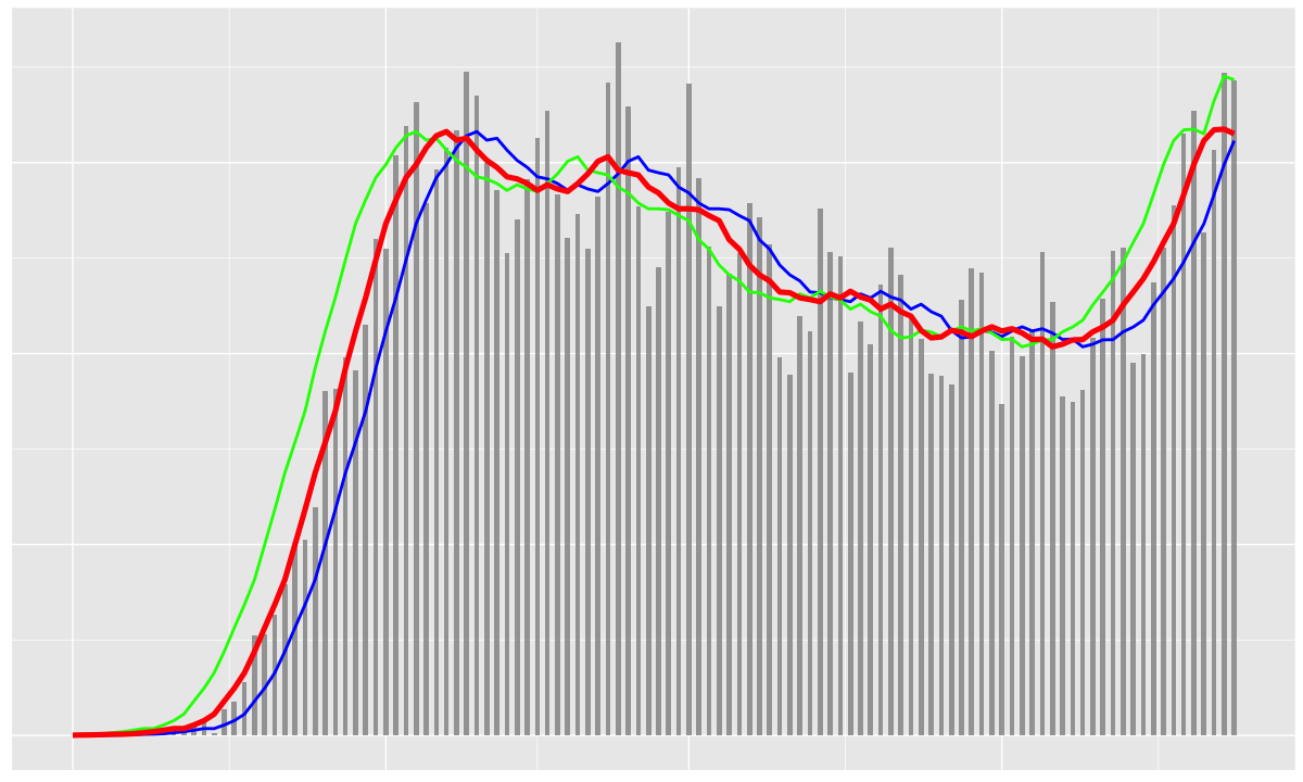
This may seem pedantic, but it gets to the heart of how tricky it can be to accurately report the magnitude of the COVID-19 crisis. Based on only the unaveraged daily values, the two worst days still lie in April, and that may be true for some time. And while as of today the centered average peaks on June 23, when we checked yesterday, with one fewer data point, June 23 was still a shade below the previous peak. Within a few days, we’ll be able to say for certain how much worse off we are now than we were when things previously looked the most bleak.
More Must-Reads From TIME
- The 100 Most Influential People of 2024
- The Revolution of Yulia Navalnaya
- 6 Compliments That Land Every Time
- Stop Looking for Your Forever Home
- If You're Dating Right Now , You're Brave: Column
- The AI That Could Heal a Divided Internet
- Fallout Is a Brilliant Model for the Future of Video Game Adaptations
- Want Weekly Recs on What to Watch, Read, and More? Sign Up for Worth Your Time
Write to Chris Wilson at chris.wilson@time.com